Ongoing
Thirty Logos
The Thirty Logos Challenge is a logo design challenge that emails realistic prompts each day for 30 days
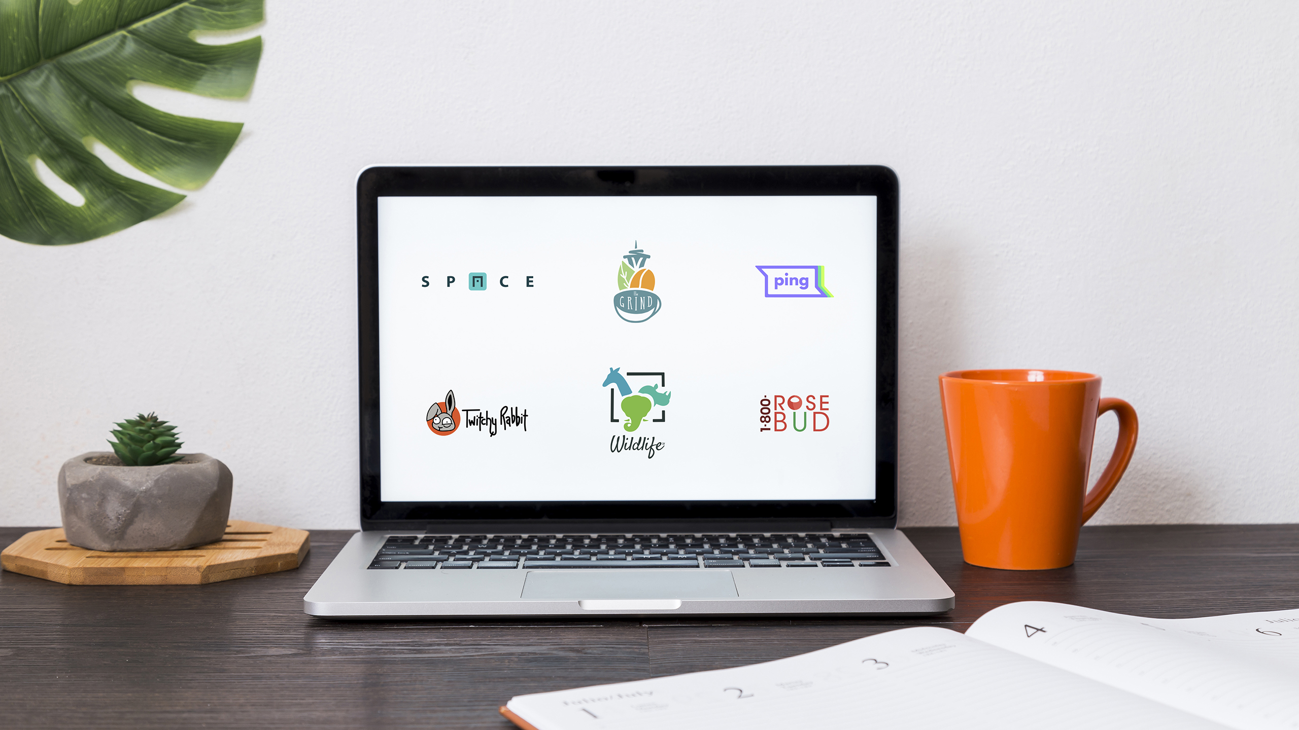
My designs for logos 1-6 are shown above. Click on a logo below to expand for more information:
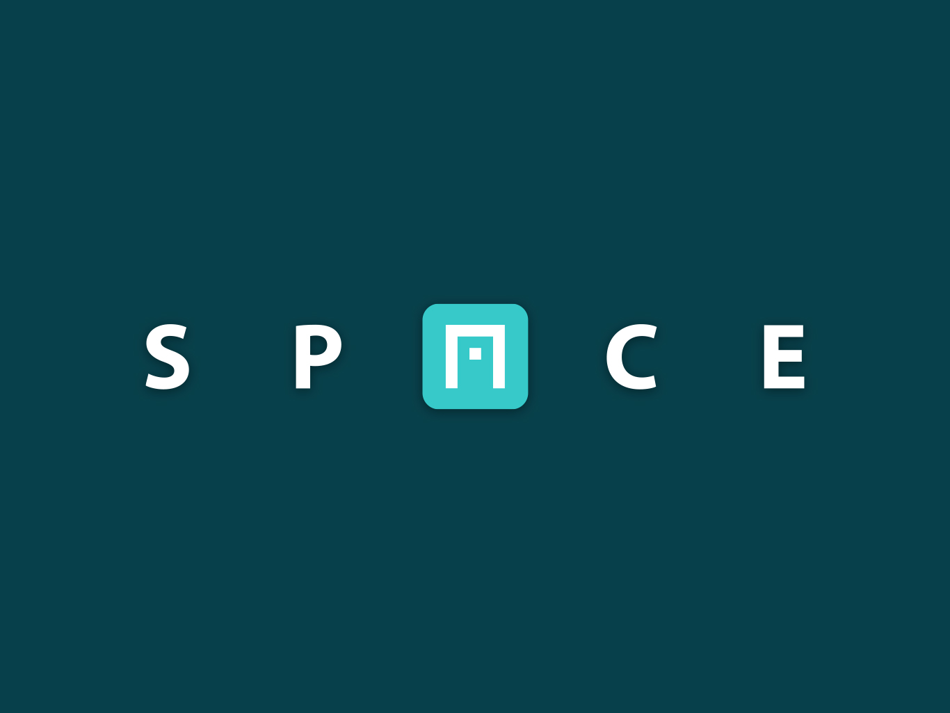
Logo 1: Space | June 2017
The key to this logo was emphasizing the modern approach to office spaces, while also emphasizing a fun environment. The letters have been kept clean and spaced out, with the “A” moonlighting as a cubicle or desk. One could say the “A” also gives a game-like appearance, similar to pong, bringing in a bit of the fun aspect of the service. The blue color emphasizes the work/professional nature of the service.
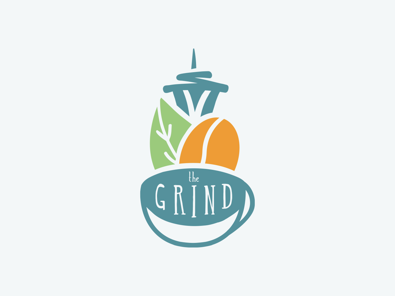
Logo 2: The Grind | June 2017
My underlying goal with this logo was to somehow incorporate an icon representative of Seattle, since this business is local to that area. I found the iconic Seattle Needle would be a great symbol to stick right atop of the cup of coffee in this logo.
The colors were chosen based off the client’s desire to stay away from the typical browns of coffee logos, as well as a focus on natural. I started with the green of the coffee leaf, and worked the other two colors off of it.
The typeface used has a handwritten feel to it, adding to the emphasis of local and natural ingredients.
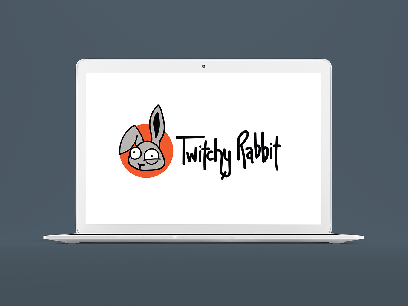
Logo 3: Twitchy Rabbit | June 2017
I honestly had a lot of fun with this one – that rabbit is so darn cute!
The key here for me was maintaining the basic imagery of the rabbit from the original logo. The new rabbit icon serves much better in smaller and icon sized spaces than the previous one, while maintaining the fun “twitchy” aspect. I took the orange from the previous logo and emboldened it, giving the logo a nice striking color to it.
The typeface is custom and hand drawn, as felt right with the fun nature of the rabbit icon.
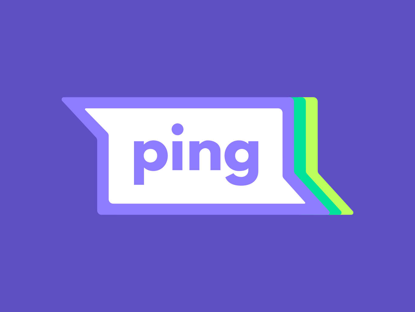
Logo 4: Ping | June 2017
I knew this logo had to be simple yet get the point across that it is a messaging platform. With that knowledge I incorporated one simple icon into this logo – that of the speech bubbles, something universally recognized. The typeface and font are kept simple and bold, the colors bright and vibrant, giving a fast moving and clean feel to it.
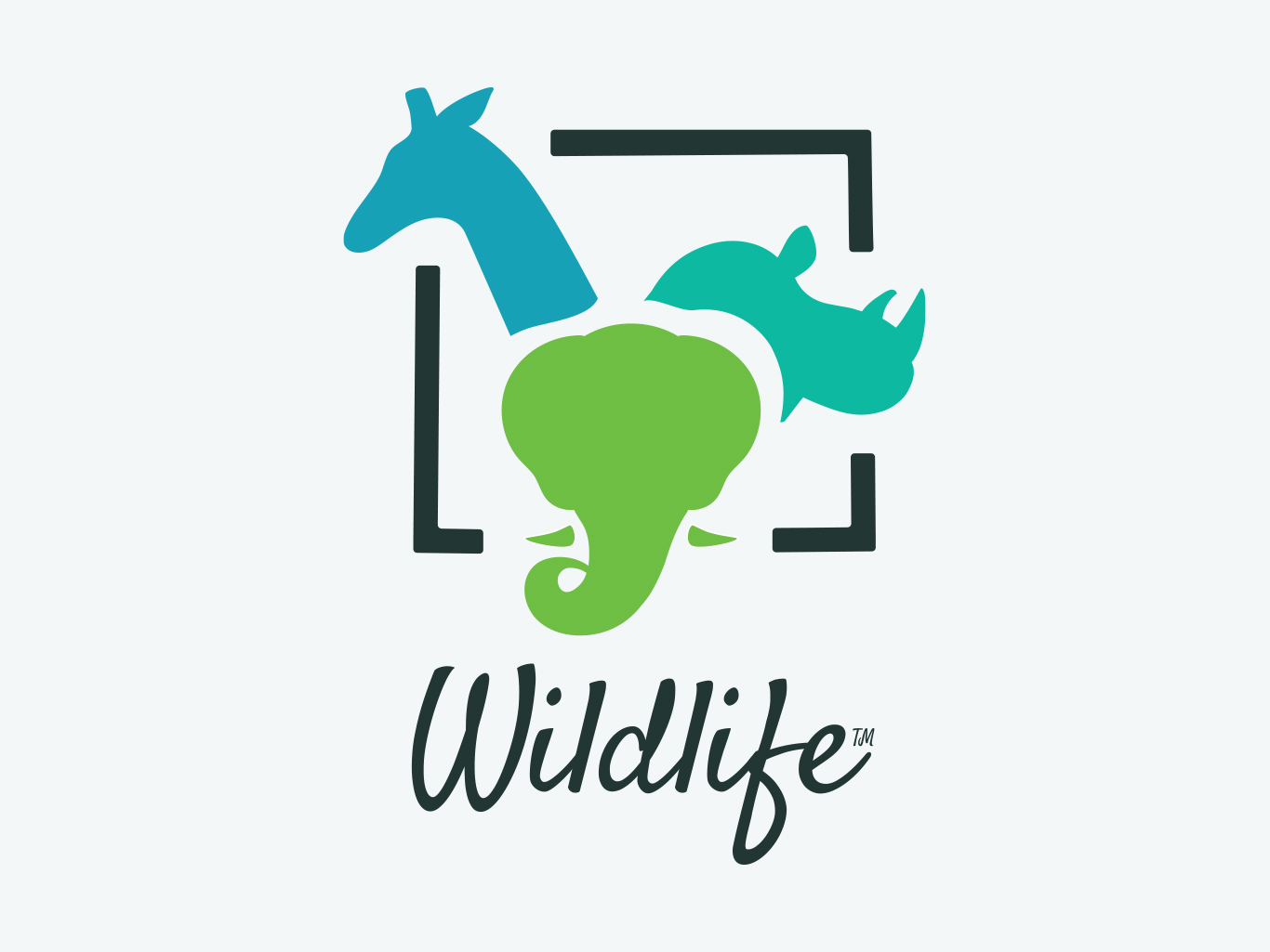
Logo 5: Wildlife™ | June 2018
A key part to the WWF logo, which this organization wanted to emulate, is its simplicity; it only requires one color to see the image of the panda, and it is identifiable in small spaces. Similarly, with this logo my goal was not only to incorporate animals, but to do so in a way that would work in b&w, and in an icon size. To that end, I used outlines of three popular animals, and enclosed them in a box to signify protecting their habitats. The square shape also makes this design easier to iconize. The Wildlife™ text utilizes the “Satisfy” font from Google Fonts, and provides a clean yet “loose” style, which I believe embodies the nature of wildlife: structured, yet free and beautiful.
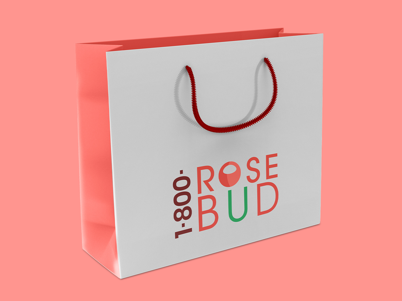
Logo 6: 1-800-ROSEBUD | March 2019
My first goal with this logo was ensuring it would be easily readable, particularly at small sizes, since it contains the phone number for the company and must be easily accessible for consumers. To achieve this while still incorporating flower imagery, I made the “O” and “U” into the shape of a rose. The color theme revolves around pink, maintaining the client’s desire for a warm feel.
Similar Projects